Why is the death rate lower and will it stay that way?
- Mark J. Panaggio
- Jul 18, 2020
- 5 min read
Updated: Jul 18, 2020
On July 9th, the Atlantic published an article entitled COVID-19 Cases Are Rising, So Why Are Deaths Flatlining? In this article they noted that cases around the country have spiked dramatically and yet the death rate has stayed relatively low. The author proposed five potential explanations for this:
Deaths lag behind cases.
Expanded testing is finding more cases, milder cases and earlier cases.
The typical COVID-19 patient is getting younger.
Hospital patients are dying less frequency.
Summer might be helping.
Given that the recent case totals have been sky high (>70000 for the last couple of days), one would hope that explanations 2-5 are the correct ones, otherwise things are going to get ugly relatively soon. Some of these explanations are not just wishful thinking. Testing has continued to increase. There is evidence that in some areas, new COVID-19 patients are young (although that seems to be changing). And, there have been some positive signs on the treatment front. (Ok, maybe the summer thing is wishful thinking.).
However, before we jump to conclusions it is worth examining the first explanation to see how much of a role the time lag could play. Since that article was written, deaths have started to rise, so its natural to wonder if that is a sign of things to come. I was curious about this, so I decided to look at the data.
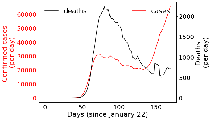
Here I have plotted the number of cases (red) and deaths (black) over time. The curves represent a 7-day moving average to smooth out the fluctuations due to the way data is reported. As expected there was a peak in cases in April, followed by a peak in deaths a few days later. Since then cases dropped until June and then rose sharply. Deaths have dropped steadily except for one blip around day 150 which is likely a fluke (a backlog of cases was reported on a single day causing an unusual spike) and a gradual rise at the tail end (which seems to be more robust).
One thing that jumped out at me as I was looking at this was the fact that the valley in cases looks like it is about 3 weeks ahead of the valley in deaths. Could that be a sign of that there is a three-week lag between cases and deaths?
One way to examine that it is to compute the correlation between deaths and cases. Correlation measures whether two signals rise and fall together. A value of 1 means they always go up and down at the same time (and by proportional amounts) and a value of -1 means they go in opposite directions. A value of 0 means there is no clear pattern. The challenge here is that we are interested in whether cases today predict deaths down the road. So instead of computing the correlation between deaths and cases now, I tried computing the correlation between deaths now and cases at some point in the past. I tried this for a variety of different lags and plotted the results below. Note: Since testing was way behind early on, I omitted the first 70 days of data (before the first peak) when doing this.
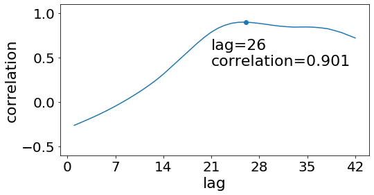
Notice that the correlation actually goes up as we increase the lag, reaching a peak at a lag of 26 days. In other words, there is little connection between the cases today and the deaths today, but there seems to be an extremely strong relationship between deaths today and cases 26 days ago. A correlation of 0.901 is quite high and it suggests that you can learn a lot about what the deaths will be by looking at the cases right now. This was way higher than I expected!
Unfortunately, this is bad news. It suggests that most of the changes in deaths can be explained by looking at the cases, and 26 days ago, the cases were just starting to rise. Since then, they have increased almost three-fold. Will the deaths do the same thing?
One way to investigate this is to try to build a model that uses case information to try to predict deaths. So, I tried a simple linear regression model (a line of best fit). It worked ok, but it seemed to be missing something important. Next I tried to incorporate the number of tests, and the percentage of positive tests using a multivariate linear regression model. The results are plotted below:
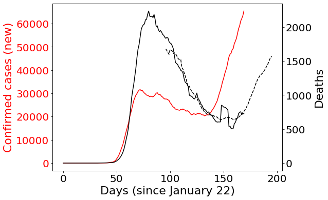
Here the black dashed curve is the prediction model. The basic idea behind it was to use the number of new cases, the number of total tests and the positive test rate to predict the number of deaths 26 days in the future. This is a way of trying to control for the number of tests (so that we don't mistake changes due to more testing with evidence that things are getting worse). You can see that it works quite well. This model was able to explain 93.7% of the variation in deaths (according to the coefficient of determination or R squared value). It tracks along with the black curve (the observed death totals) quite consistently.
The scary part is what happens when we start projecting into the future. This model suggests that the death totals are likely to continue rising in response to the rising case totals (around 26 days behind) and could increase almost three-fold just as the cases did. Let's hope the model is wrong!
We should be careful about reading too much into the specific numbers for the final prediction. First off, there is a very simple model that I put together quickly. There are better models out there that are more robust (although most if not all agree that the death totals are going to rise). Secondly, this model is also somewhat sensitive to changes in the inputs. For example, if you leave out total tests, the predicted deaths only rises to 1000 per day instead of 1600. On the other hand, if you leave out positive tests, then the deaths rise to 3000 per day. So, there is quite a bit of uncertainty about that final value.
Nonetheless, this analysis does suggest that there are two things we can be confident about:
Deaths do lag behind cases by 3-4 weeks. This factor can explain most of the trend in the death totals.
Case totals have risen dramatically, and given the timeline, it is very likely the deaths will follow.
So, good news all around. You are welcome.
PS. One other factor that I did not account for in this model, but that would be worth considering is that the relationship between cases and deaths may be nonlinear. In a linear relationship, 100 additional cases would always correspond to the same number of additional deaths no matter how many cases there were in the first place. However, it seems likely that at some point, that would break down. If hospitals reach capacity, then additional cases would likely cause more deaths, than when there is plenty of room in the ICU. That would work in the other direction as well. Decreasing the number of cases near the peak could cause a great reduction in the number of deaths than would decreasing the number of cases by the same amount during a time when the outbreak was not as severe.


That certainly seems plausible. The data from Florida (https://twitter.com/zorinaq/status/1276578004072673280/photo/1) suggests that the recent rise of infections started with the young but is now spreading to other age groups.
Thanks Mark. These graphs really help me organize my understanding.
The ratio of the initial spike vs current was higher and (not to get too technical) looks less saggy.
I can understand the ratio change. At first everyone was equally careful. Now older people remain careful while the young are progressively less so. Thus more cases being a younger average with a lower ratio of mortality.
We're lucky that we can isolate as much as we want.
Some older folks cannot isolate completely from the young. They can be more careful but as the number of positive cases grow around them the odds rise against them. They are the PowerBall with more and more tickets bought each week.
So to…