Your social network is larger than you think
- Mark J. Panaggio
- May 24, 2020
- 6 min read
In case anyone was wondering why this blog went from having a few posts per week to nothing for a couple of weeks, my family and I just experienced the joys of a cross-country move in the midst of a pandemic. Thankfully things went smoothly, and we are now (mostly) settled in our new home in Maryland. Although this transition prevented me from writing for a while, it did inspire some questions that I want to address in this post.
Since the start of the pandemic, my world has felt very small. Outside of my immediate family, I have had few face-to-face interactions with people and those few interactions have almost always occurred outside and/or from a distance. So, when the movers and packers came into our home last week to load up all our possessions, it was a strange feeling. For a moment, my world felt just a bit bigger and it got me thinking, how big was that world? How did these interactions change the size of my social network?
From an epidemiological perspective, your social network includes the people that you interact with in a potentially infectious manner along with all of the people that those people interact with and so on. So, for the last couple of months, my social network was mostly limited to my immediate family, but the moment I allowed the movers into my home, they joined my social network as did all of the people in their networks. It is hard to say how many people that new and larger network included.
Under normal circumstances, the majority of the human race makes up a single interconnected network. One of the surprising properties of this network is sometimes called the “small world” property. In pop culture, this phenomenon goes by a number of different names such as “six degrees of separation” and “(Kevin) Bacon’s Law”. All of these refer to the fact that the average distance between people as measured by the smallest number of steps between them (think friend of a friend of a friend…) is surprisingly small. In the context of an epidemic, this is bad news. It means that pathogens can spread from one corner of the globe to another in just a few steps and, thanks to air travel, these types of long-range interactions are more frequent than ever before making us more vulnerable to pandemics.
Many of the non-pharmaceutical interventions that have been implemented during this pandemic (travel bans, lock-downs, social distancing, etc.) are designed to counteract this effect. They do this by removing connections from the network to either increase the distance between people thereby slowing the spread of the virus or to fragment the network preventing the virus from reaching certain segments of the population.
To illustrate this, let’s consider a hypothetical small town of 100 people. Below I have drawn the social network for this town using blue dots to represent people and black lines to represent connections between people.

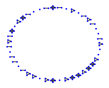

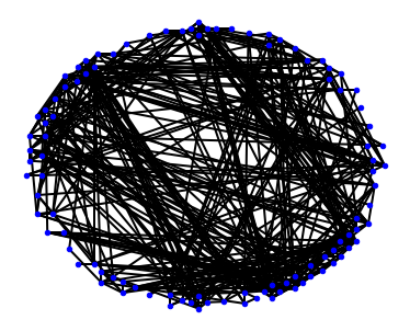
In the first image, I am only showing the connections between members of the same household. Some households have one member (singles are represented by isolated blue dots), others have two members (couples are represented by a pair of dots connected by a line), while still others have more than two members. In this case, household sizes were generated randomly using an average of 2.63, the average household size in the US. (For the mathematically inclined, these sizes were drawn from a Poisson distribution.) In the second, I have plotted this same network, but this time I included connections between households. You can think of these two pictures as a network under normal circumstances (second) and under extreme social distancing (first).
This brings us back to the question I started wondering about. How big is my world? From a network science perspective, this is a question about the size of the component to which I am connected. If my network looks more like the first, then my component is small. This would be good news during an outbreak, because there are very few people who could actually give me the virus and those people have few connections that could allow them to get sick meaning that my risk of contracting the virus is quite low. However, if my network looks like the second, then the chances of getting the virus are much higher. As soon as one person in the network gets sick everyone else is at risk.
Short of actually mapping out the network (one of the purposes of contact tracing), there are at least two important quantities to consider when assessing the vulnerability of a network during an outbreak: the size of the largest component and the typical distances between nodes. The former sets the maximum outbreak size and the latter determines how quickly the outbreak can spread throughout the network. In the examples above, the largest component (sometimes called the "giant" component) contains 4 people (first) and 100 people (second). In the first, the distance between most people is infinite since most people are not connected, but in the second, the average distance (as measured by the number of connections) is around 2.7 and the median distance is 3. This means that the second network will fare much worse during an outbreak since the virus can spread further and faster.
This raises an interesting question. As people take a more relaxed approach to social distancing, which is to be expected as states remove restrictions on movement, how will those two quantities change? How fast will the typical distance between people decrease and the size of the giant component increase as people start to let friends and neighbors back into their lives?
One way to test this is to run an experiment. We can start with a random network much like the first one above. Think of this as an extreme example of social distancing where people only interact with members of their household. Then we can gradually add connections into the network. I will do this in four different ways:
1. Random: By adding connections uniformly at random. (Blue)
2. Preferential (degree): By adding connections at random in such a way that people are more likely to connect to people that are highly connected. This is known as preferential attachment. This seems to be a feature of social networks under normal circumstances. (Orange)
3. Preferential (friends): By adding connections using another form of preferential attachment in which we favor connections between people that are friends of their friends. (Green)
4. Preferential (hybrid): By adding connections using a combination of all three approaches. (Red)
Then we can track how the structure of the network changes as these connections are added. I did this for 30 different networks and then plotted the size of the giant component (top) and the median distance (bottom), aka path length, vs the average degree (the number of connections per person) averaged over all 30 trials. For the sake of time, I used networks with 100 nodes and then gradually added up to 200 additional connections. You could certainly do this with larger networks, but the results are similar.
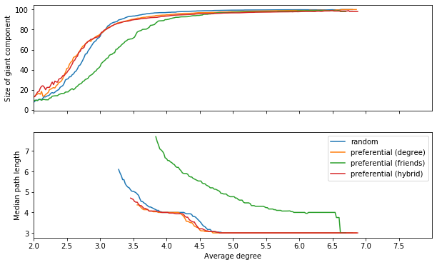
As you add additional connections, the median path length decreases steadily. This makes sense. Additional connections give you more possible ways to connect people, so it should “bring people closer together”. This can be a good thing if you goal is to spread information, but as I mentioned earlier, it can also make it easier for pathogens to spread.
The size of the giant component very quickly rises until it is close to the size of the network (100 people in this case). This means that as you add more connections disconnected parts of the network suddenly link together creating new avenues for the spread of disease. Adding just one extra connection per person can be enough to cause that dramatic structural change.
This rather abrupt transition from a fragmented network to a highly connected network with relatively short typical distances is related to a phenomenon called “percolation”. It is an example of what physicists call a “phase transition” and mathematicians call a “bifurcation” or what is colloquially known as a “tipping point”. The existence of a tipping point means that very small changes can have big effects. In this case, adding just a few connections to the network can take you from a highly disconnected state where epidemics cannot really spread at all, to a highly connected state where almost everyone is connected and, therefore, where an epidemic can spread quite widely.
What does all this mean? Well, it means that letting a couple of friends “into your circle” can cause your social network to grow very quickly. In a very real sense, you are not just letting your friends into the circle, you are also letting in everyone your friends have been in contact with. If everyone does this, this can quickly transform the global social network from a fragmented state to an interconnected state. In a situation where asymptomatic transmission is possible, this increases everyone's risk of getting the virus and/or spreading it to someone else.
In my case, just letting a couple of movers into my home meant that the number of people I was connected to, both directly and indirectly, jumped from the four members of my immediate family to potentially hundreds or even thousands of people. The likelihood of transmitting the virus during brief interactions like the ones I had is small, but it is nonzero and that is one of the reasons why experts are encouraging us to avoid unnecessary interactions with those outside of our households.
So, as we all adjust to this next phase of reopening, I hope that you will keep in mind what I was surprised by from this little experiment, once you add connections, your social network can grow quite quickly. And if you are already doing that, then your network is probably larger than you realize!


Comments